What's New

Words of Wisdom
52
cards and 15 activities to spark conversations and make sense of learning.
Learn more HERE.
What We Do
The Firefly Group helps people make sense of what they learn and experience.
Whether facilitating a group for better decision-making, keynoting a conference, leading a training, or writing an instructional design, we use novel methods that engage, spark creativity, and produce memorable results.
 If
this sounds like a good direction for your organization, let's talk about
how we might collaborate! Please give me a call (802.257.7247) or send an
. - Brian
If
this sounds like a good direction for your organization, let's talk about
how we might collaborate! Please give me a call (802.257.7247) or send an
. - Brian


 Your ETR (Estimated Time to Read): 10 minutes Your ETII (Estimated Time to Implement Ideas): 5 weeks |
What
can you teach with a eight washers tethered to a string?
Watch my video and find out!
September
2018
How to Have Fun with Statistics
|
Say
It Quick |
Discoveries bits of serendipity to inspire and motivate |
Ideas fuel for your own continuous learning |
Activities tips and tricks you can try today |
|
Tired of Retirement - Keeping meaning in mind |
Crunching Numbers - Deriving unexpected meaning from data |
Playing with Numbers - Experiment to draw meaning from data |
APE - The Analog Percentage Estimator |
 And
don't miss this opportunity to meet me and learn more about having fun with
numbers at the North American Simulation and Gaming Association's annual conference
in Rochester, NY, October 16 to 19, 2018. Learn
MORE
And
don't miss this opportunity to meet me and learn more about having fun with
numbers at the North American Simulation and Gaming Association's annual conference
in Rochester, NY, October 16 to 19, 2018. Learn
MORE
Most people are impressed with numbers. But that does not mean that statistics and hard facts are the best way to gain support or convince people to join your cause. In fact, sometimes numbers do more to confuse than illuminate. In this issue of the Firefly News Flash, we'll look at some surprising uses of social media data and share tips to improve the effective analysis and understanding of data by your group beginning with this story of only 99 words.
Tired of Retirement
For years, Mitchell had a successful business selling shoes in our small town. He had a reputation for personable service and quality products. He thrived on the regular contact with all types of customers as well as business and community leaders.At retirement, he moved with his wife to their northern Minnesota lake home where Mitchell spent his days fishing and, literally, losing his mind. He became listless, irritable, forgetful. Dementia set in. When he took a part-time job selling cars, his usual alert, vibrant personality returned immediately.
If you've got a purpose, you've got life.
Crunching
Numbers
Deriving the unexpected from data
Next month I will be in Rochester, New York for the annual conference of the North American Simulation and Gaming Association where I will lead a session called "How to Have Fun with Statistics." Since numbers are on my mind, it's not surprising that information and articles about data have grabbed my attention.
Here are two:
In the New York Times Magazine of August 19, the article "Under Their Thumb," describes efforts by data mining businesses to keep lawmakers from protecting user privacy. Our ability to collect vast amounts of data then analyze and draw conclusions from it has become frightening because of the unexpected associations they can reveal. Instead of having to construct elaborate polls with carefully randomized samples, we can now crunch all the numbers. Tabulate every web page you've visited, catalogue every on-line purchase, triangulate your location at any point in time and then target advertising toward you and predict when you'll purchase something and for how much.
In the University of Vermont Alumni magazine of July 2018, the article "The Quantification of Happiness," describes how Twitter and Instagram are being used by researchers to monitor national health trends, measure happiness, or predict suicidal ideation in individuals. The on-line apps we enthusiastically use to share texts, trivia, and photos can be scooped up, analyzed, and correlated to identify social trends faster and more reliably than using traditional polls.
People on the verge of suicidal depression, for example, can be identified by the type of photos (lots of blue, gray, and dark tones) that they post on Instagram. This kind of analysis could become an effective screening tool for suicide in an emergency room setting.
The manipulation of number we are able to do today reminds me of Darrell Huff's book, "How to Lie with Statistics." Though written in 1954, it is still must reading for anyone entering the number-crunching field. With the popularization of "fake news" today, it's even more relevant. Because they can be so precise, we place a lot of credibility in numbers. But Huff describes the common fallacies and assumptions we make when presented with statistics. He challenges readers to ask basic but hard questions about any data:
- Who says so?
- How do they know?
- What's missing?
- Does it make sense?
These questions are the minimum that we should be asking as we try to distinguish the factual from the fake.
More Information:
"Under Their Thumb," by Nicholas Confessore, The New York Times Magazine, August 19, 2018."The Quantification of Happiness" by Rowan Jacobsen, Vermont Quarterly, Issue No. 81, July 2018, www.uvm.edu/vq
How to Lie with Statistics by Darrell Huff, W.W. Norton and Company, © 1954. ISBN-10: 0393310728
The Secret Language of Leadership by Stephen Denning, John Wiley & Sons, Inc. © 2007. ISBN 978-0-7879-8789-3
Made to Stick by Chip Heath and Dan Heath, Random House © 2007, ISBN-13: 978-1400064281
Playing with
Numbers
Experiment to draw meaning from data
Because they suggest the accuracy of measurement, we assume numbers will make our message convincing. But numbers by themselves are one of the least effective methods of winning support.
I believe this is because numbers are an abstraction. They don't mean much until they are compared to something else.
If I tell you that 79,535 people died from diabetes in the US last year, what do you know? That's a big number but how big is it, really? Should you be worried? If I tell you that diabetes accounts for only 3% of all deaths in the US, you might not be concerned. If I tell you that diabetes is the seventh leading cause of death, you might become worried. And if I tell you that the number of people who die from diabetes is like eliminating the population of Scranton, PA or Gary, IN every year, you might decide to take action.
This last comparison creates an emotional reaction. And emotion is essential for grabbing attention and gaining commitment to any message.
Stephen Denning in the book "The Secret Language of Leadership" provides a formula for delivering an effective message. Notice that statistics are used to reinforce an emotional message, not as the only means to deliver it.
1. Getting Attention - Tap into what is unexpected, emotional, personal, relevant, or negative
2. Stimulating Desire - Gain commitment to your cause
3. Reinforcing with Reason - Facts and numbers add gravity to the emotion that stimulates desire
4. Continuing the Conversation - Provide opportunities for further learning
"Made to Stick" by Chip Heath and Dan Heath has a similar formula which also de-emphasizes the importance of numbers and data.
My workshop for the North American Simulation and Gaming Association conference, "How to Have Fun with Statistics," is focused on ways to bring meaning and relevance to the numbers we use to teach, inspire, convince, and drive to action. I'll share methods to dramatize the size of numbers, make them tangible, and connect them to the stories of our daily lives.
In the 99-Word Story, Mitchell longed for a purpose. What is the purpose of your statistics? What meaning do your numbers add to your message? What do you expect people to do differently as a result of knowing them? Perhaps you are thinking that the numbers will speak for themselves and you can kick back, relax, retire from the responsibility of explaining them. Perhaps, like Mitchel, you should re-engage.
If you decide to reinforce your message with numbers, bring them to life. Give them purpose. For a simple suggestion, read about APE in the Activity section below.
![]() APE:
The Analog Percentage Estimator
APE:
The Analog Percentage Estimator
Fold a sheet of paper to demonstrate fractions or percentages
It's not always easy to grasp the significance of numbers, percentages, and statistics. We know that 15% is less than 85% and that they add to a whole 100%. But what does that look like? What does it feel like? What does it mean?
This activity is designed to make the numbers more tangible. Use it to lead your group into a deeper discussion about numbers and their significance for your issue or your organization.
APE: The Analog Percentage Estimator
Goal: To make fractions and percentages more relevant for participants
Participants: Any size group
Time: 10 to 20 minutes
Materials: One sheet of paper per personProcedure: Distribute a sheet of paper to each person. Explain that you have important information to share with them but first you would like them to follow your instructions. Share these instructions in your own words.
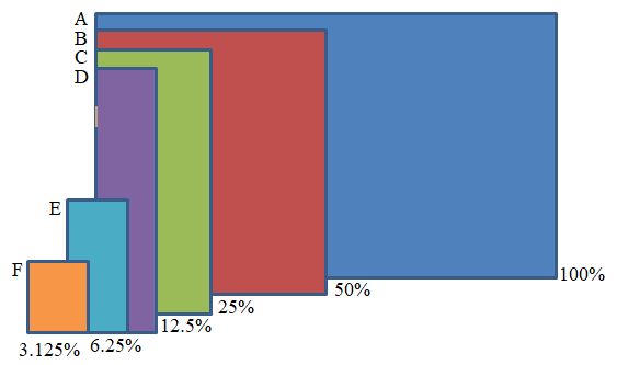
Figure 1
Hold your paper in landscape format, oriented so the longest edges are at the top and bottom. (For your own reference you can refer to Figure 1, A [blue].)
Fold your paper in half, left to right (Figure 1, B [red].)
Fold it in half again (Figure 1, C [green].)
Fold it again (Figure 1, D [purple].)
Fold in half top to bottom (Figure 1, E [light blue].)
And fold once more top to bottom (Figure 1, F [orange].)Unfold your paper. This is your APE, your "Analog Percentage Estimator." Here's how it works.
- Fold your APE in half - that's 50% (red)
- Fold in half again - that's 25% (green)
- Fold in half again - that's 12.5% (purple)
- Fold in half top to bottom - that's 6.25% (light blue)
- Fold in half again - that's 3.125%
Now you are ready to have people use their APE. Ask them to unfold their APE and refold it or shade in sections to represent different percentages you want to talk about.
As people manipulate their APE, be sure to give them opportunities to react to the proportions they are comparing. Use their reactions to stimulate discussion about the relevance, validity, and significance of the numbers.
For example, during a workshop about emotional intelligence, I asked people to shade 15% of their APE (a little less than 5 of the smallest divisions [orange]). I then pointed out that one study found that for a group of managers, 15% of their success was attributed to their intellect and skill while the remaining 85% of their success was a result of their emotional intelligence.
Initially people were impressed with the difference between the shaded area and the remaining 85%. But quickly, they began asking questions. How do we define success? Who were these managers and how many were in the sample? What culture were they from and what was their background? Who conducted the survey and can they be trusted? How do you actually measure the different effects of intellect and emotion anyway? And, significantly, why does this 15% - 85% statistic seem believable? Perhaps we like this imbalance between intellect and emotion because we are looking for "scientific" verification of our anecdotal experience.
When you use the Analog Percentage Estimator, be sure to challenge people with similar questions. Then what happened.
|
Whether you need a keynote speaker, or help with strategic planning, performance improvement, or training facilitators and trainers in your organization, I look forward to your call (802.380.4360) or . -- Brian |
Read previous
issues. Click Library!
To add or delete your name to our mailing list, email
with a short note in the subject line.
I want this newsletter to be practical, succinct, and thoughtful. If you have suggestions about how I can meet these criteria, please let me know! Send me an with your thoughts and ideas.
Home
| Services | Products
| Mission | Ideas
| The Group | The
Buzz
(c)
2017 The Firefly Group